Going into this project, I knew I wanted to do something relating to data visualisation. I was inspired by the works of Aaron Koblin, The Rumpus Room, and most things on Information is Beautiful.
My Digital Media Project in second year also explored the idea of gathering data and presenting it in a visual format with Planets of Change. So this area has always been something that has interested me.
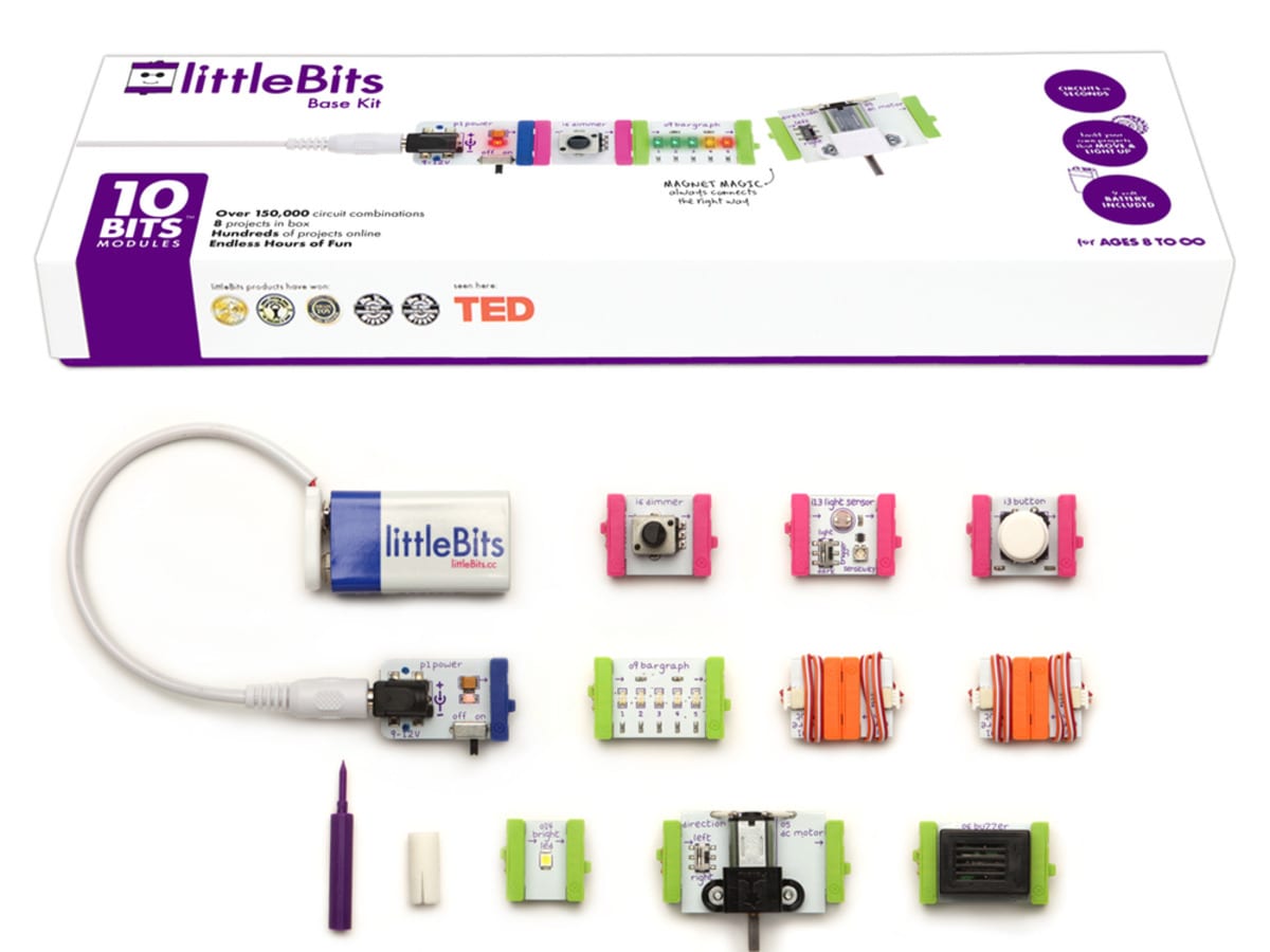
I was inspired by the workshop we had using littleBits, and used this to inform my idea and develop the concept for the project.
The Concept: To take information that we primarily only see online, and present it in an offline, visual way.

Using Twitter as an example; Twitter gathers huge amounts of data every day from users through what they talk about and hashtag. It can get massive amounts of quantitative data and paint a picture on what the major issues of the day are. We see this data through the ‘trending’ section.
However, if we wanted to see other data, like comparing the amount of times two different hashtags have been tweeted, we generally have to go out of our way to see that. And when we do, I think the impact is lost, as the majority of people will just see the number on the screen, and won’t be able to fully understand the importance of what that number represents.
An Example Idea
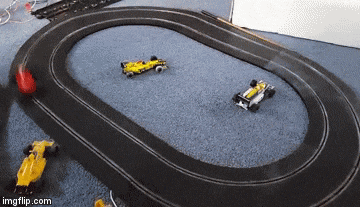
One idea that I had as a solution to the above problem, would be to set up a Scalextric track, where one car moved every time a certain #hashtag was tweeted, and the other car moved when a different one was. This way you would be able to visualise which of the hashtags were being tweeted about more.
The decision would then be what would you use this tool to show?
It could be used as a political tool. One car being #Hillary the other being #Trump. Or it could be used to highlight how we as a society have a warped sense of priorities. One car being #SyrianRefugees, the other being #Bieber. Or it could simply be an entertainment piece. You could get people to tweet #RedCar and #BlueCar and have a Twitter powered race.
I like the idea that it can be all of the above. This is a tool at the end of the day, and can be used and customised however the user wants.
Output for the Module
So in terms of what I hope to produce at the end of this module; I would like to put on an exhibition using several examples of visualising online data in a physical way. The Scalextric track would just be one example, and I feel like I would probably need more than just that to explore the potential of this idea.
– Alex